
Chroma Brand Identity
A website-derived reference for Chroma: observed colors, typography, components, and assets extracted from https://www.trychroma.com/. This snapshot is not official brand guidance. Verify current values and usage permissions with the original source.
Color Palette
Brand palette extracted from https://www.trychroma.com/.
Typography
Each font links to its Google Fonts page where available.
Not found on Google Fonts? Agent Instructions that you can follow if you have permission to use the fonts:

CharacterQuilt.com suggests this flow that can help:

1. Open the company's homepage in a browser with DevTools open.
2. In the Network tab, filter by "Font" (or by extension: woff2, woff, ttf, otf).
3. Hard-reload the page and click around (pricing, blog, careers) — some weights only load on specific routes.
4. For each captured font URL: right-click → Save As to download the file locally.
5. View the page's CSS (DevTools → Sources, or curl the stylesheet URLs) and copy out the matching @font-face declarations. Rewrite each `src: url(...)` to point to your local file path.

Programmatic alternative: load the URL with Playwright or Puppeteer, listen for `response` events whose `Content-Type` starts with `font/`, and write the body to disk. The CSS extraction step is the same.

Only do this if you have permission to use the brand assets — most proprietary fonts are licensed and may not be redistributable.
Visual Assets


UI Components
Live previews rendered using Chroma's actual button styles.
Brand Personality
Chroma Brand in the Wild
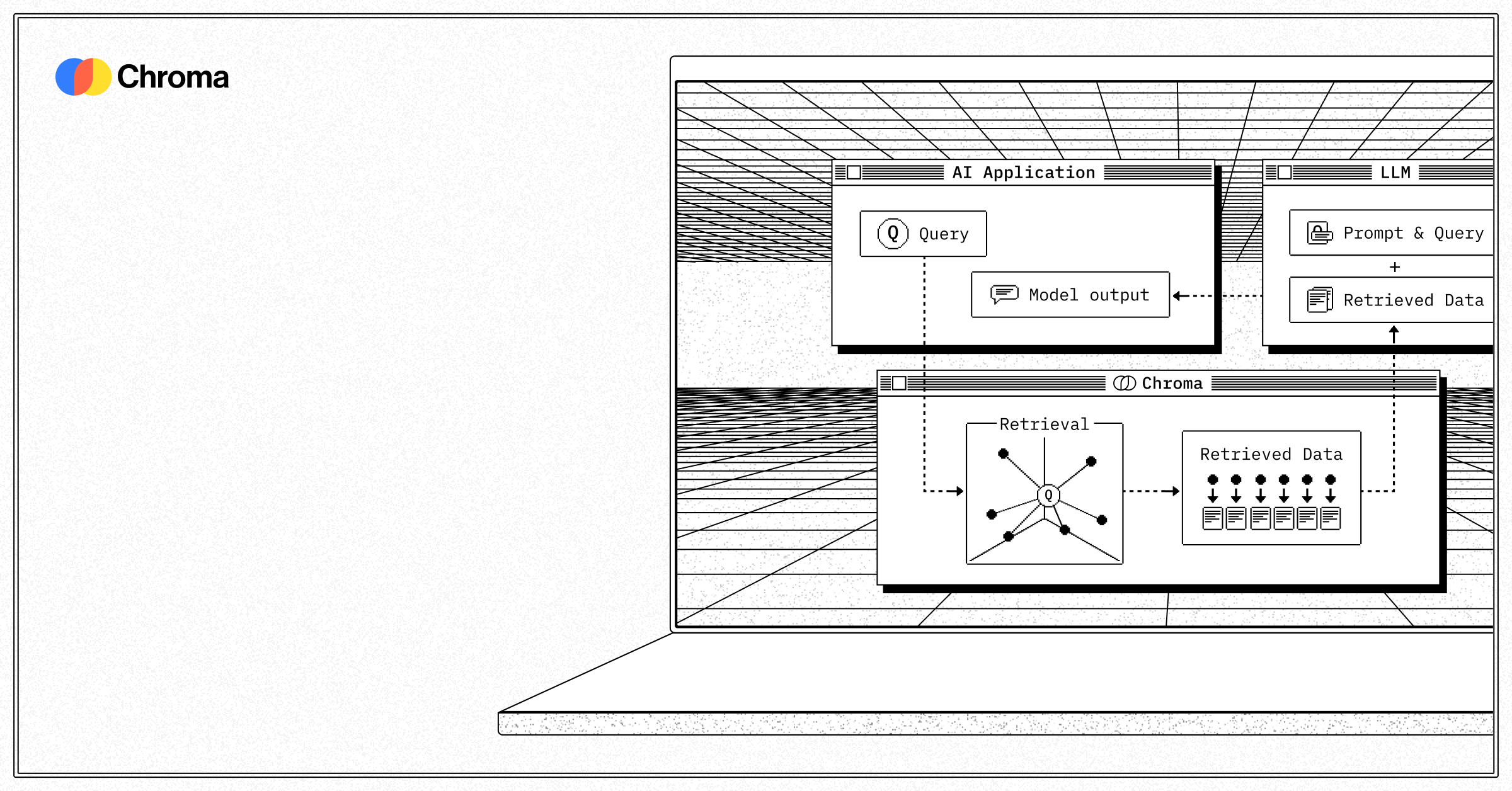
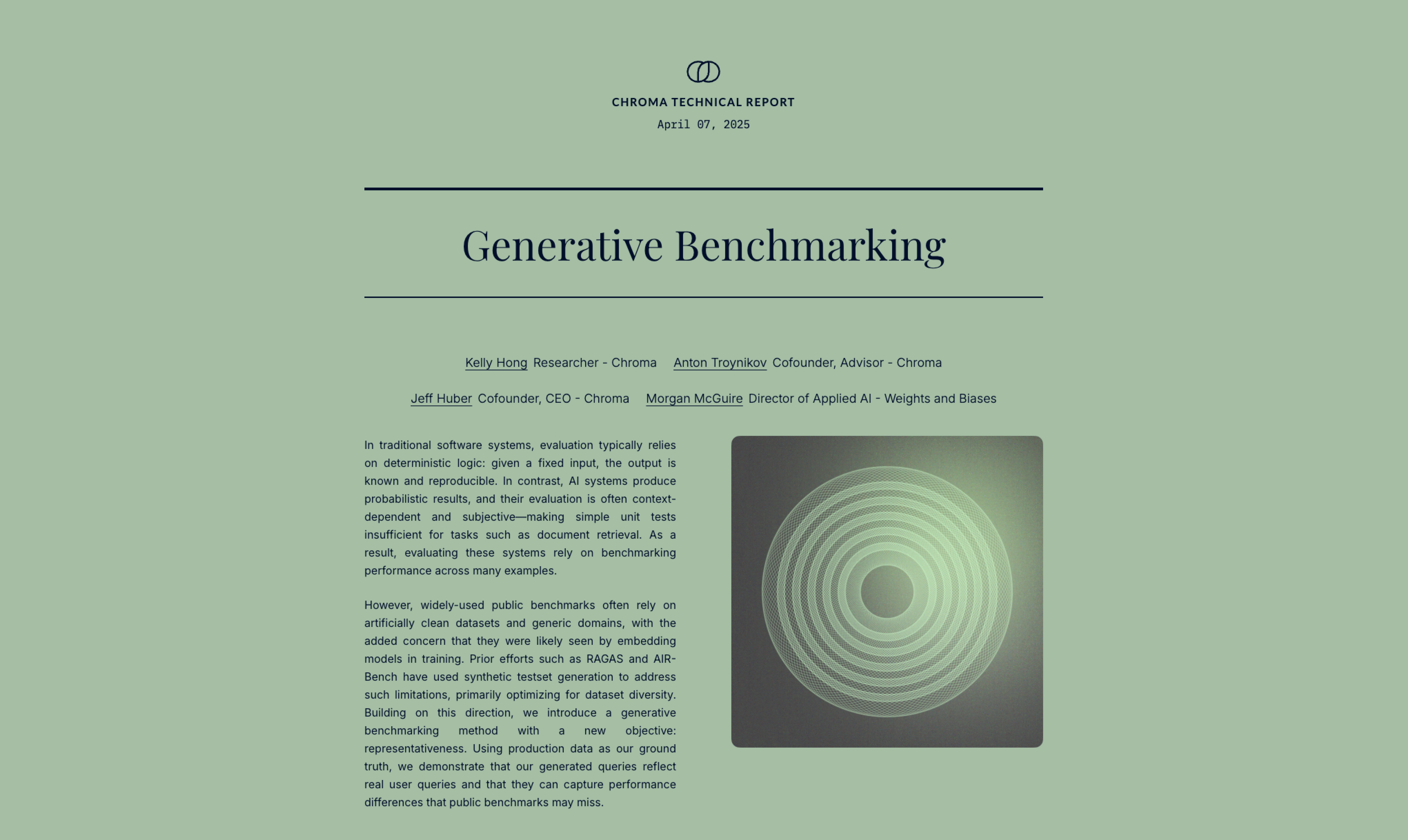
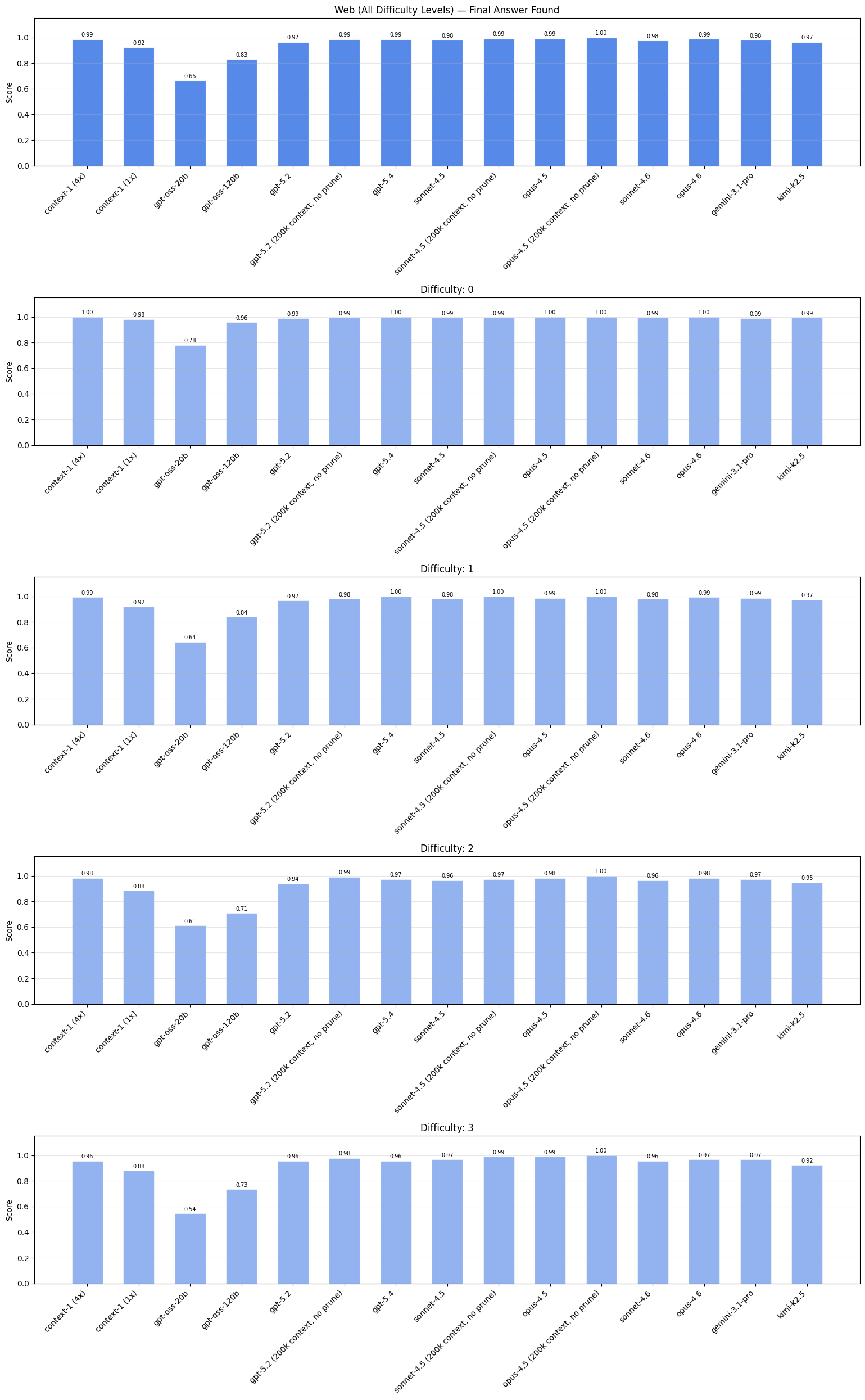
Real-world brand assets, ads, campaigns, and marketing materials.

Frequently Asked Questions
What is Chroma's primary brand color?
The website extraction recorded #364153 as the primary color for Chroma. This is an observed website value, not a verified official brand specification.
What accent color does Chroma use?
The website extraction recorded #171717 as an accent color for Chroma. Check the source website or official brand guidelines before using it in new work.
What font does Chroma use?
The extraction detected Inter as a primary typeface on https://www.trychroma.com/. Other pages or materials may use different fonts.
Does Chroma use a light or dark theme?
The captured website used a light color scheme, with a recorded background of #FAFAF9. The current website may differ from this snapshot.
Where can I find Chroma's logo?
The logo asset recorded from https://www.trychroma.com/ is included in the machine-readable JSON profile linked above. Check the original source for the current asset and usage permissions.
How was this brand profile generated?
This profile was extracted from https://www.trychroma.com/ using the Firecrawl branding extraction API, which inspects the live page's CSS, fonts, color tokens, and component styles. It is not affiliated with or endorsed by Chroma.
Methodology
Brand data on this page was extracted from https://www.trychroma.com/ using the Firecrawl branding extraction API, which extracts website design information. An extraction date was not recorded for this profile. The source site may have changed since the snapshot was captured, and a redirect may lead to a different company or product. Brand-in-the-wild images were found using image search. Cached previews link to original third-party sources. This page is published by CharacterQuilt and is not affiliated with or endorsed by Chroma.
Machine-Readable Profile
Direct endpoints for agents, designers, and tooling. No login or auth required.
{
  "colorScheme": "light",
  "fonts": [
    {
      "family": "Inter",
      "role": "body"
    },
    {
      "family": "IBM Plex Mono",
      "role": "monospace"
    }
  ],
  "colors": {
    "primary": "#364153",
    "secondary": "#101828",
    "accent": "#171717",
    "background": "#FAFAF9",
    "textPrimary": "#0A0A0A",
    "link": "#4A5565"
  },
  "typography": {
    "fontFamilies": {
      "primary": "Inter",
      "heading": "Inter"
    },
    "fontStacks": {
      "heading": [
        "Inter"
      ],
      "body": [
        "Inter"
      ],
      "paragraph": [
        "Inter"
      ]
    },
    "fontSizes": {
      "h1": "24px",
      "h2": "16px",
      "body": "12px"
    }
  },
  "spacing": {
    "baseUnit": 4,
    "borderRadius": "0px"
  },
  "components": {
    "input": {
      "background": "transparent",
      "textColor": "#101828",
      "borderColor": null,
      "borderRadius": "0px",
      "borderRadiusCorners": {
        "topLeft": "0px",
        "topRight": "0px",
        "bottomRight": "0px",
        "bottomLeft": "0px"
      },
      "shadow": "none"
    },
    "buttonPrimary": {
      "background": "#171717",
      "textColor": "#FAFAFA",
      "borderRadius": "6px",
      "borderRadiusCorners": {
        "topLeft": "6px",
        "topRight": "6px",
        "bottomRight": "6px",
        "bottomLeft": "6px"
      },
      "shadow": "none"
    },
    "buttonSecondary": {
      "background": "#FFFFFF",
      "textColor": "#364153",
      "borderColor": "#D1D5DC",
      "borderRadius": "33554400px",
      "borderRadiusCorners": {
        "topLeft": "33554400px",
        "topRight": "33554400px",
        "bottomRight": "33554400px",
        "bottomLeft": "33554400px"
      },
      "shadow": "none"
    }
  },
  "images": {
    "logo": "https://www.trychroma.com/_next/static/media/chroma-wordmark.0~1c352v-zy35.svg?dpl=dpl_GaMunTYzau8H3aiHFBDnAoLpDwXF",
    "favicon": "https://www.trychroma.com/img/favicon.ico",
    "ogImage": "https://www.trychroma.com/card.png"
  },
  "__llm_logo_reasoning": {
    "selectedIndex": 0,
    "reasoning": "Logo rejected: Red flags detected (UI icon). Selected #0 because it is visible, located in the header, links to the homepage, and matches the brand name 'Chroma'.",
    "confidence": 0.95,
    "rejected": true,
    "source": "llm"
  },
  "__llm_button_reasoning": {
    "primary": {
      "index": 1,
      "text": "See open roles",
      "reasoning": "Button #1 ('See open roles') is likely the primary CTA due to its action-oriented text and distinct dark background color (#171717), which stands out against the light background."
    },
    "secondary": {
      "index": 4,
      "text": "What can I build with Chroma?",
      "reasoning": "Button #4 ('What can I build with Chroma?') serves as a secondary CTA with a light background (#FFFFFF) and informative text, providing additional engagement without overshadowing the primary CTA."
    },
    "confidence": 0.9
  },
  "personality": {
    "tone": "modern",
    "energy": "medium",
    "targetAudience": "developers and AI professionals"
  },
  "designSystem": {
    "framework": "tailwind",
    "componentLibrary": ""
  },
  "confidence": {
    "buttons": 0.9,
    "colors": 0.9,
    "overall": 0.9
  },
  "__llm_metadata": {
    "logoSelection": {
      "llmCalled": true,
      "llmSucceeded": true,
      "finalSource": "llm",
      "rawLogoSelection": {
        "selectedLogoIndex": 0,
        "selectedLogoReasoning": "Selected #0 because it is visible, located in the header, links to the homepage, and matches the brand name 'Chroma'.",
        "confidence": 0.95
      }
    },
    "buttonClassification": {
      "llmCalled": true,
      "llmSucceeded": true
    }
  }
}